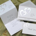
 Every aspect of your wedding should be outstanding. Your wedding invitations and other stationery like RSVP and Save-the-Date are also not exception. While choosing the design and paper for the wedding invitations and other stationery, you should also have to choose the weddings fonts carefully, depending upon various factors. As a rule of thumb, a delicate font adorns smaller sized invitations the best; also a simple font is easy for your guests to read. Some couples even choose mixed fonts, like a bigger font for their names and a smaller font for rest of the text. While mixing two or more fonts, you should take care to choose the ones complementing each other. Let’s see how you can choose the best font for inviting guests on your big day.
Font Expressing the Wedding Mood
Your wedding font should express the mood of your big day. It’s fun to have the font which will tell your guests beforehand what type of celebration they would participate in, so that they too can come prepared accordingly.
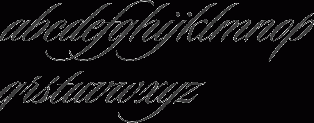
Vintage Wedding – Vintage wedding can be expressed the best with a font having the air of an old scripture. Slanted than normal, having too many curves and varying thickness and thinness of letters – all these express a vintage wedding the best. You can choose another font but having these characters for your names. But in all, the font will show that the guests are invited to a classic wedding. Some recommended fonts are Burgues Script, Aphrodite Pro, Parfumerie Script Pro, Chopin Script, and so on.
Modern Wedding – A modern wedding can be denoted by a font having more distinguished, clear lines. The font should radiate simplicity, with not much of fuss or fancy. Examples are Mishka, Alina, Breathe, Wishes Script, Baronessa, Liebe Ericka, etc.
Formal Wedding – There are many fonts which denote that the wedding will be formal. These fonts look clearly upgraded than handwriting, giving a more ceremonial look. You can choose fonts like Aire, Belinda, Fidelia Script, Respective, Copperlate Gothic, and many more.
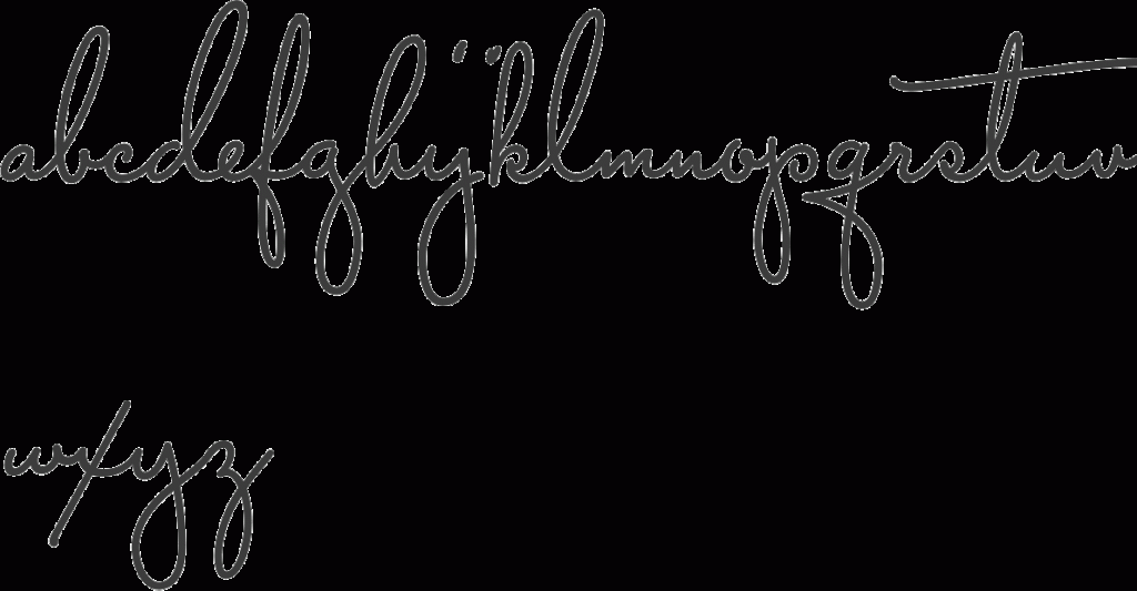
Informal Wedding – When you are going to have an informal wedding, a font expressing coziness and a laidback feeling is perfect. It should look more like handwriting than printed letters, inviting your guests more with love than formality. Some examples are Emily Lime, Brannboll Fet, Carolyna, Liebe Erika, Dear Sarah Pro, and many others.
Easy to Read
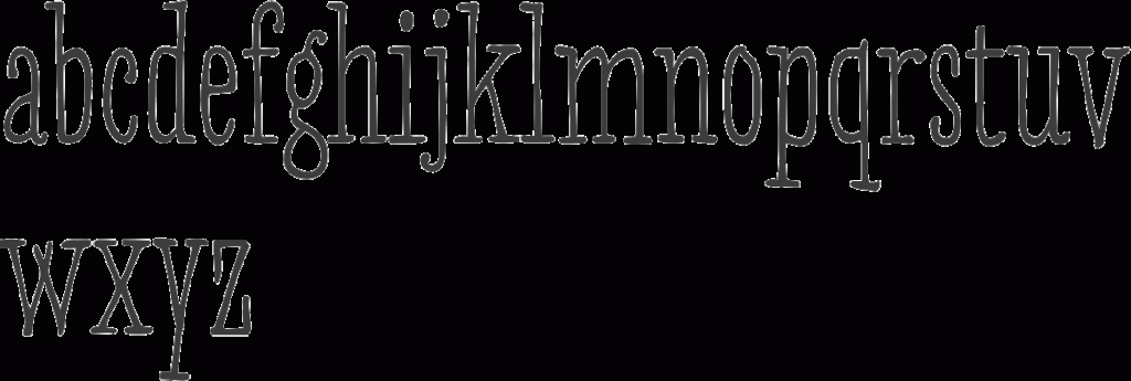
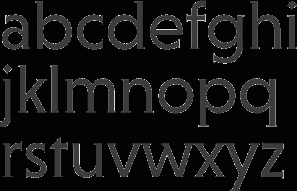
Whatever font you choose, it should be easily readable. For example, an overly ornate font may look nice but is difficult to read. Maybe some of your guests are old or having some vision problem. They should not get confused about your wedding venue and date. Keep in mind to choose a font with clear letters and numbers, that don’t resemble some other letters and numbers, like 8 with 0 or 3 and F with 7, etc.
You can choose your wedding font which looks nice to your eyes. But you should also consider that your guests will read your invitations and they should get proper information of your wedding, without any confusion. Though nowadays phone is a medium through which confusions can be removed. But all your guests may not have your telephone number. In that case, your wedding invitation should be the best intimation to your guests and so the font should be chosen that way. Thus priority should be given to clarity, more than beauty, while choosing your wedding fonts.

